Pages

Friday, 29 November 2019

UI Example 2007

This example demonstrates some of my experience creating UI that suites the subject matter, especially one that has a specific theme.

This project was developed in a team setting, as a major project as part of my multimedia studies at TAFE.

The entire project was built using Adobe Flash, and was intended to be a take-home product for school children who visited a museum exhibit about dinosaurs.


Flash Menu
The DVD also featured some video components, but consisted mostly of games for primary school children. These games ranged from jigsaw puzzles and mazes, to arcade style games that were more changeling.

It was up to our team of students to decide on all aspects of the design and the interactivity. Each student utilised their strengths to share the load amongst the team, and specialised in their areas of expertise.

Wednesday, 19 June 2019

Image Processing Work

Below I have posted some examples of image processing. The original and processed images are listed in that order. Each image has been clean and manipulated to make the process of including it in an online pre-viz system easier.

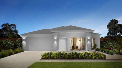
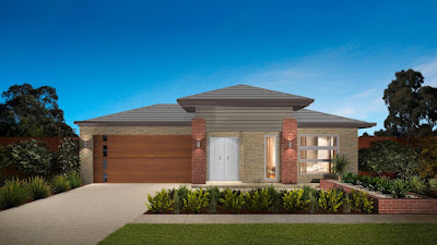
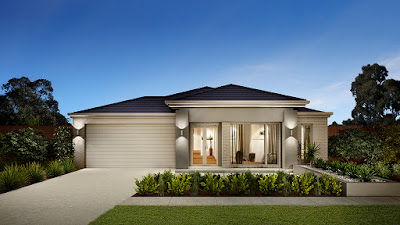
An exterior image requires any brick work and roofing to be blanked out to a neutral grey. If necessary, the image will be cleaned up and straightened as well to aid further work on the image.

Raw image processing is performed using Adobe Photoshop, this is where the image is cleaned up and existing textures and surfaces are blanked.

Image areas are then setup or stencilled using an in-house app. The output of this app is uploaded into the online visualiser, with the image areas are then processed to indicate the kinds of products that can be applied, in the visualiser, these take the form of colours or textures.

For any interior images, the same process applies to some degree. An existing patterns and textures need to be brought back to a grey, while maintaining any shading and lighting from the unprocessed image.

The original images are not owned by myself, and are copyright to their respective owners. I provide them only as an example of my recent work experience and skills.
Original image

Cleaned image
Visualiser example output

In these first 3 images, the top 2 show some stages in the preparation of the image for use in a visualiser. The last image is a similar image which has been modified inside a visualiser and shows user selectable textures over specific areas of the house.

In the next set of images, we move to the interior examples. This first example demonstrates how a kitchen image is cleaned up to be more suitable for inclusion in a online visualiser.

Original image

Cleaned image

The last example, shows how a complicated ensuite photo is processed and cleaned ready for inclusion in an online visualiser.

Original image

Cleaned image


Sunday, 7 April 2019

Restaurant Newspaper Advertisement Project 2005

This advertisement for a fiction restaurant had only a few requirements, page layout and logo design. The ad copy and the photos were supplied, so the key requirements could be focused on.

This fictional restaurant resides within the building of a former bank, hence the name of the restaurant: Teller's. Photoshop was used to enhance the supplied photos, page layout for this two column corner ad was done using Illustrator.

Below is a photo of the complete work mounted on card for final year assessment.


Sunday, 3 March 2019

iOS Applications 2008-2019

I have recently been the primary and solo developer of several iOS applications. Each application has very different purposes and intended user base.

Although many of the applications are no longer available in the App Store, I can provide links to those which are still available and provided samples of those which I was able to design and develop.


This application has been designed to allow it's users to view upcoming events around Australia. Initially focused in Tasmania, but with the potential to showcase events across the country.

The app will automatically determine the location of the device and present the user with events around them, with the option to expand the search radius up to 300km away.


The Hanson app is a professional's tool, aiding them to calculate the required amount of concrete for different projects, or preview the available surfaces for driveways, paths and more around a clients home.


TENDAYS ON THE ISLAND 2013

This was the second app for the TENDAYS arts festival that I had worked on. I had the task of both designing and developing this application. This application was able to fetch the event data from the festival's website, our company had no control of the website, and presented a great challenge with how to work with foreign data formats.

The following image samples from the app are the original design mockups for how the app would appear on a user's iPhone.


Much of the user interface design was inspired by the TENDAYS website, this included recreating much of the iconography of the site to maintain the user experience across where possible.

Saturday, 2 March 2019

WOI Event Poster Samples 2015

These event posters where created to be included within the app that I developed from 2015 to 2019 while employed at Autech Software & Design, What's On In. The posters represent a small set of those created for the initial launch of the app, and feature various events of The Spiegeltent Hobart of 2015.

I developed a template in Adobe Illustrator to produce these posters as efficiently as possible, so that only the main content had to be altered for each event poster.


The application was developed initially just for iOS, but also became available for Android within a year on the initial version went live. I developed the iOS version almost completely by myself for most of the time up to 2018. The online components of the application were also originally developed by myself, until I was able to receive assistance from another employee.

Find out more about Spiegeltent.

Find out more about What's On In.

iOS App Demo Video 2009

This sample features a mixture of design and technical skill demonstration. This video was created to be included in a demo iOS app. The app was created as a sample piece to sell onto potential clients, who could use the app within their own set of tools for their own clients, helping them to sell their house based products to customers.

The demo video demonstrates the basic operation of the application, and is accessible from within the application's main menu. This video was built using Adobe Flash and other components of the suite where needed, with the final animation being exported in the correct format for being played on the intended devices, and a royalty free music track added as well.


Wine Label Project 2006

The project brief focused on a suitable design of the student produced wine at TAFE Alanvale campus, a label was required for both white and red wine. At the time the project was assigned, the current wine label was deemed to be no longer suitable, a much more modern and up-to-date look was now required.

The following design was selected for use by TAFE for the following few years. Given this requirement, the design was produced in a way the client could edit the file until the next replacement design was needed.

Both Adobe Illustrator and Photoshop were utilised to create this wine label design, Illustrator for the layout, and Photoshop for adjusting the supplied photos.


Portrait Photography 2005

The brief of this project was to produce two portraits of a fellow classmate, combining the use of artificial lighting and backgrounds. While one photo was to remain in full colour, the other was to be converted to black and white.

Retouching of the photos were permitted as well as being a component of the project assessment. The below sample is a photo of the final work mounted for assessment.


Wednesday, 27 February 2019

Trace of Elegance website

I was assigned to design and develop this website as a solo project. I chose to develop the original version using Adobe Flash at a time when the technology was still favoured over HTML only development environments. The core facilities of Flash were utilised in areas of animation, full screen resizing and loading of smaller components such as the image slideshows.

The following samples of the project are from the original design files, the rendering of the Flash files no longer matches the intended design style.


As the Flash version did not easily allow for minor edits or being able to add on other sections, the project was re-developed for HTML and CSS with editing and maintenance in mind when it became necessary.

Bürgen Bread Ad Campaign 2005

The brief of this project specified the design of a series of advertisements to enhance the sales of Bürgen Soy-Lin bread to their target market: women of all ages.

The featured bread of this campaign has been developed specifically to enhance the diet of women in any stage of their life, and so it was designed to sell the message to the reader. The campaign would have been included in suitable magazines which have a female target market.


The above sample is a photo of the final pieces mounted for assessment purposes.